Evodia Brand Refresh
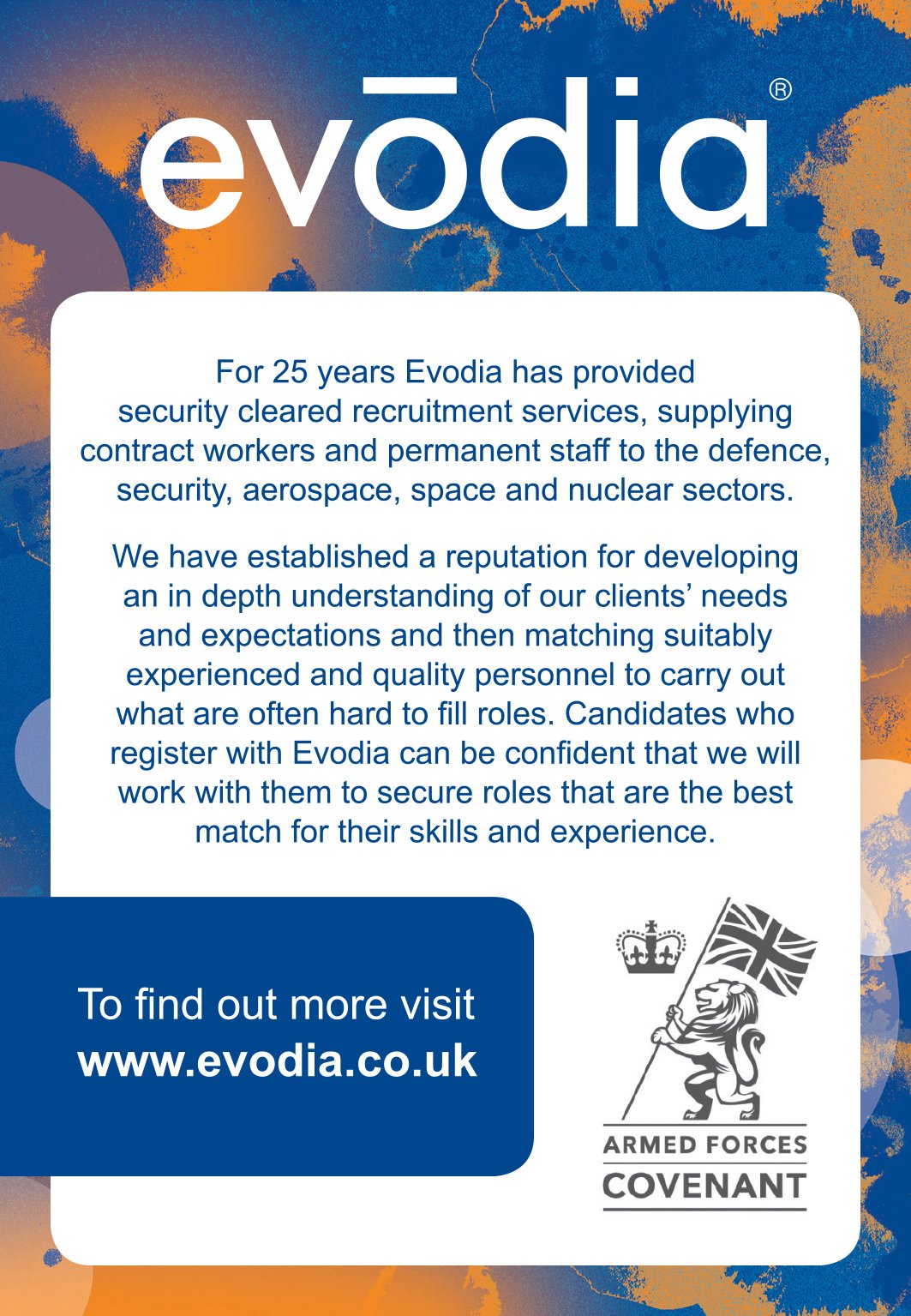
Ten years on from working with Evodia on their initial brand refresh, I worked with them again to create an updated visual language that aligned with the new focus and direction of their business. They kept their timeless evodia mark and use of cyan in their brand palette, but were looking for an appealing new visual style that could be implemented in their printed literature, exhibition stands and online platforms and help them to stand out within what is considered, quite a corporate sector of business.
I created a series of textures and painted effects by hand and scanned them in, applying digital colour and subtle reference to the circular ‘atoms’ that were predominant in the previous brand.
The final selection was a dynamic and abstract visual that was implemented as a versatile background graphic for numerous uses across the brand, including exhibition stands, the Evodia website, a company brochure, adverts and in-house literature.
A series of icons were also developed to represent the different sectors that Evodia work with.